November 21st, 2024
11 Best Books to Read about Data Visualization
By Filip Wojda · 9 min read

As much as you appreciate the interactive data visualization Julius AI provides, you may find yourself wondering what’s going on behind the scenes. How does the platform deliver its information graphics? What are the processes and data visualization fundamentals that transform your raw dataset into a usable graphic filled with insights?
It’s those fundamentals that you’ll learn if you check out these 11 data visualization books:
1. Naked Statistics by Charles Wheelan
2. Factfulness by Hans Rosling
3. Now You See It by Stephen Few
4. Information Dashboard Design by Stephen Few
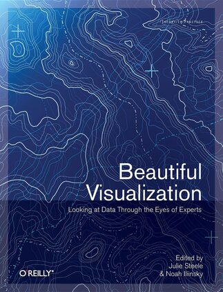
5. Beautiful Visualization by Julie Steele
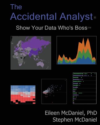
6. The Accidental Analyst by Eileen McDaniel
7. The Functional Art by Alberto Cairo
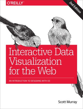
8. Interactive Data Visualization for the Web by Scott Murray
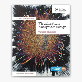
9. Visualization Analysis and Design by Tamara Munzner
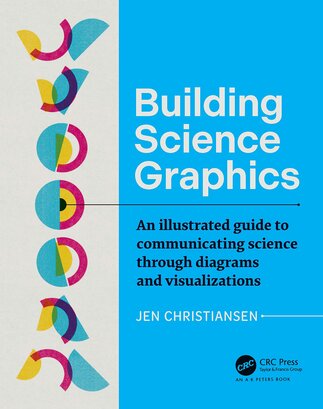
10. Building Science Graphics by Jen Christiansen
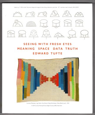
11. Seeing with Fresh Eyes by Edward Tufte
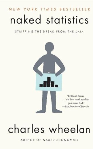
Naked Statistics by Charles Wheelan
Think of Naked Statistics as a primer on the statistical concepts that lie behind the functional art of data visualization. Despite the title, there’s nothing particularly sexy going on here. Just plain English explanations of how you can use statistical concepts to work through your raw data and extract insights.
The lessons come quickly. The explanations are simple. And if there’s one thing that ensures we recommend this book ahead of many others, it’s that you’ll remember what you read because of its straightforward approach.
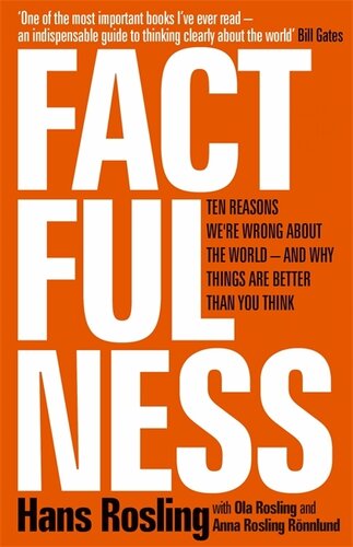
Factfulness by Hans Rosling
You know you’ve become data literate when you’re able to understand what a collection of numbers actually means. Enter Factfulness, an interesting journey into the statistical concepts that help you discover what a dataset is really telling you.
It’s your data analysis guide, set up in such a way that visualization comes naturally because the book helps you understand the data science needed to turn numbers into visuals.
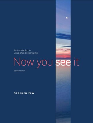
Now You See It by Stephen Few
What charts and data graphics should you use to represent your dataset? That’s the question Stephen Few’s book answers, with its first six chapters homing in on what makes a good data analyst and the role that colors, luminosity, and similar factors play in your visualizations.
After that, you’ll get more practical as Few leads you through exercises that sharpen your budding visualization skills.
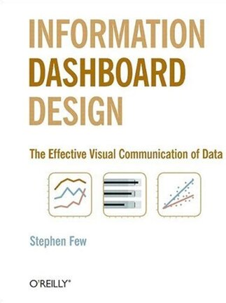
Information Dashboard Design by Stephen Few
Few makes his second appearance on our list with a book that zooms in on visual explanations for creating dashboards.
What makes a good dashboard? What about a bad one? Few reveals the answers, starting with a crash course in data visualization before leaning into what “information dashboard” is really about – design. The book is as much about how to use your visualizations as it is about how to create them.
Beautiful Visualization by Julie Steele
With Beautiful Visualization, Julie Steele collects insights from two dozen of the world’s foremost data visualization experts to deliver a smorgasbord of concepts and approaches. You’ll dig into the storytelling aspect of visualization here.
How do you use colors, charts, and design philosophies to create a narrative out of your available data? Read Steele’s book and you’ll get your answers.
The Accidental Analyst by Eileen McDaniel
Not all who analyze data are trained data analysts. Eileen McDaniel recognizes that The Accidental Analyst is geared towards those who’ve been thrust into a position where they have to visualize data with no prior experience.
Packed with data visualization examples, it’s a book that can transform a sales or HR expert into a temporary visualization Picasso without getting so in-depth that what they learn takes over the day job.
The Functional Art by Alberto Cairo
The Functional Art is almost as much of a love letter to data visualization as it is an explanation of best practices within the field. Cairo’s passion pours from the page as he teaches you how to not only visualize data but do so in an aesthetically pleasing way.
You’ll even get some insight into the psychology of the human mind as Cairo explores some clever little tricks you can use to take advantage of the brain’s quirks.
Interactive Data Visualization for the Web by Scott Murray
Think of Scott Murray’s book as the data visualization handbook for the digital age. It’s as much a web programming primer as it is a series of visualization lessons, with Murray guiding the way as you learn how to use HTML, CSS, and JavaScript (among others) to display data on the web.
Murray explains how to use various web-based programming languages to create simple designs, all while gradually turning his lessons up a notch. By the time you hit the “Interactivity” chapter, you’ll see how just a handful of lines of code can allow you to create hover and color-changing effects that make your visualizations much more attractive.
Visualization Analysis and Design by Tamara Munzer
Tamara Munzner takes an interesting approach with Visualization Analysis and Design. Each chapter starts with a schematic constructed to represent the topics Munzner is about to introduce.
Then, she digs into the weeds, starting with the basics of explaining different data types before working up to the strategies available to help you manage complex visualizations. By the end, you’ll be able to create better data visualizations thanks to the techniques Munzner teaches and the foundational knowledge she delivers in the early chapters.
Building Science Graphics by Jen Christiansen
Another book written with the beginner in mind, Building Science Graphics starts with an explanation of what information graphics are and why they’re so important in scientific communication. Christiansen builds from there.
The book is essentially a process laid bare, demonstrating evidence-based strategies that help you create scientifically-approved data visualizations. There are even worksheets – giving the book a scholastic feel – that you can use to jumpstart your approach to any new visualization project.
Seeing with Fresh Eyes by Edward Tufte
There is an art to data visualization. A statistical sweeping of the brush to deliver imagery that unpacks the hidden meaning behind datasets. Few understand that concept as well as Edward Tufte, who delivers a book that is as much about the philosophy of communication as the process of visualizing information.
It’s a beautiful book, albeit one that introduces some interesting concepts that clash with traditional information visualization. But that’s the point. This is Tufte’s love letter to his life’s work and it contains insights only the man himself could deliver.
Get Hands-On Experience Today with Data Visualization by Using Julius AI
Each of these 11 data visualization books delivers something a little different. Some take the reader on a journey from novice – or a complete newbie – data visualizer to a refined information specialist. Others look at the industry through a more complex and well-informed lens to offer new takes on age-old concepts. All are worthwhile reads for anybody who wants to understand the science that goes into creating visual explanations of complex datasets.
It's often that very science that sits behind Julius AI’s output. Even without these books, you can deliver stunning and informative visualizations with our AI tool. Designed to chat with your files and deliver expert-level insights in seconds, Julius AI is the data visualizer for the person who wants to save time while delivering powerful information graphics. Try it today.
