July 15th, 2025
Best Data Visualization Tools for Business Intelligence Success
By Simon Avila · 5 min read

Making decisions based on gut feelings is a thing of the past. Now that we have data upon data at our fingertips, modern businesses use data to thrive.
In fact, a significant majority of top companies are actively investing in data-driven strategies to gain a competitive edge [1]. At the heart of this transformation are Business Intelligence (BI) tools—powerful software solutions that collect, process, and analyze vast amounts of business data to provide clear, actionable insights.
A critical component of any successful BI strategy is data visualization. By transforming raw numbers and complex datasets into intuitive charts, graphs, and dashboards, these tools empower everyone in an organization to understand performance, spot trends, and make informed decisions.
This article explores the best data visualization and BI platforms available today, with a special focus on business intelligence platforms for non-technical users, helping you choose the right solution to drive your business forward.
The Shift to Self-Service BI: Empowering Every User
Historically, accessing business insights was a bottlenecked process. Business users would submit a request to a dedicated IT or data analytics team, wait for them to run a query, and then receive a static report. This process was slow, inefficient, and stifled curiosity.
The modern era of BI is defined by self-service. Self-service BI platforms are designed with user experience as a priority, featuring no-code interfaces and drag-and-drop functionality that allow non-technical users to explore data and create visualizations on their own [3]. This approach not only accelerates decision-making but also reduces the burden on technical teams, freeing them to focus on more complex data infrastructure and governance tasks.
Key features that empower non-technical teams include [1]:
• Drag-and-drop dashboard builders
• AI-powered insights and anomaly detection
• Natural language queries (NLQ)
• Predictive analytics capabilities
Top Business Intelligence Platforms for Data Visualization
Choosing a BI tool is a significant decision. The right platform must align with your company's data sources, user skill levels, and strategic goals. Based on industry analysis and user reviews from platforms like Gartner and G2, the following tools consistently rank as leaders in the market [4].

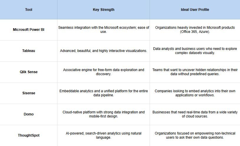
1. Microsoft Power BI - Microsoft Power BI is a market leader, celebrated for its user-friendly interface and deep integration with other Microsoft products like Excel and Azure [4]. It offers a powerful free version for individual users and cost-effective plans for teams, making it one of the most accessible BI platforms. Its no-code, drag-and-drop environment allows users to quickly connect to data sources, build reports, and publish interactive dashboards [2].
Best for: Organizations of all sizes, especially those already using the Microsoft software stack.
2. Tableau - Now part of Salesforce, Tableau is renowned for its best-in-class data visualization capabilities. It allows users to create stunning, highly interactive, and insightful dashboards that make complex data easy to understand [4]. While it has a steeper learning curve than some competitors, its power and flexibility are unmatched for deep visual analysis.
Best for: Data-driven organizations that prioritize sophisticated and compelling data storytelling.
3. Sisense - Sisense stands out for its full-stack, end-to-end BI platform that handles everything from data preparation to visualization [2]. Its key differentiator is the ability to embed analytics anywhere—into applications, workflows, and products—using the Sisense Fusion platform [5]. This makes it a favorite for software companies and enterprises that want to provide data insights as a feature for their own customers.
Best for: Businesses that need to deliver white-labeled or embedded analytics to customers and partners.
4. Qlik Sense - Qlik's unique Associative Engine allows users to explore data in any direction, uncovering connections between data points that might be missed in traditional, query-based BI tools. Qlik Sense is a self-service platform that empowers users to create personalized visualizations and dashboards, promoting data exploration and discovery across the organization [4].
Best for: Teams that need to perform exploratory data analysis and discover non-obvious insights.
The New Wave: AI and Conversational BI
The next frontier in making data accessible is the rise of AI-driven and conversational BI. These tools move beyond drag-and-drop interfaces to allow users to simply ask questions in plain English.
ThoughtSpot was a pioneer in this area, offering a search-like experience for enterprise data [6]. Users can type questions like "monthly sales by region for the last quarter" and instantly receive an interactive chart. This approach dramatically lowers the technical barrier for business users to get answers to ad hoc questions.
An emerging player taking this conversational approach to the next level is Julius AI. Julius is an AI-powered data analysis platform where users can interact with their data through a chat-based interface. You can upload a file (like a CSV or Excel sheet), and then ask Julius in plain English to clean the data, perform calculations, identify trends, and generate visualizations.
This method is designed specifically for knowledge workers who may not have dedicated analyst support, effectively turning anyone into a data analyst without needing to learn a complex tool or write a single line of code.
Key Criteria for Selecting Your BI Tool
When evaluating business intelligence platforms, especially for non-technical users, consider these critical factors [7]:
• Ease of Use: Does the tool have an intuitive interface? Can a non-technical user create a report without extensive training?
• Integration: Can the platform easily connect to all your critical data sources, from databases and spreadsheets to cloud applications? Domo, for example, is known for its extensive library of data connectors [8].
• Scalability: Will the tool perform well as your data volume and user base grow?
• Data Governance: Does the platform provide robust features for managing data security, quality, and access control?
• Cost: Evaluate the total cost of ownership, including licensing, implementation, and training.
Final Thoughts: Fostering a Data-Driven Culture
The best data visualization tool for your business is the one that empowers your team to make smarter, faster decisions. The modern trend is clear: a move away from siloed data experts and toward self-service platforms that democratize data access.
Whether you choose an established powerhouse like Power BI or Tableau, an embeddable solution like Sisense, or an innovative AI-powered analyst like Julius, the goal is the same. By placing powerful, intuitive tools in the hands of your business users, you can unlock the insights hidden in your data and build a truly data-driven culture that fuels sustainable growth.
Want to see what the hype is for AI-powered business intelligence tools? Then try out Julius for free today and discover for yourself why more and more people are trusting it.
