November 26th, 2024
9 Best Python Data Visualization Libraries
By Jaden Moore · 8 min read
It’s not always easy to spot trends or patterns in big lists of numbers and statistics. That’s why data visualization – the process of transforming data into visual formats, like charts, graphs, and maps – is such a critical part of statistics and data analysis.
Often, it’s the most effective or sometimes even the only way for us to truly interpret data, and Python data visualization libraries rank among the most effective, useful data visualization tools out there. With that in mind, this guide looks at some of the best Python libraries for data visualization.
Understanding the Basics of a Python Data Visualization Library
Before we look at some of the leading Python libraries, let’s first look at what a Python data visualization library actually is and how it works.
In brief, Python libraries for data visualization are groups of Python-based tools designed for taking data and presenting it in visual format.
There are lots of these libraries out there, and each one offers its own distinct functions and benefits. Some let you create highly interactive and customizable visualizations, some help you generate visuals for embedding on websites, and still others are focused on specific sorts of data, like geographical data.
What Are the 9 Best Data Visualization Libraries?
Next, let’s look at the nine best Python data visualization libraries you can use today:
1. Matplotlib
2. Seaborn
3. Plotline (GGplot)
4. Bokeh
5. Pygal
6. Plotly
7. Geoplotlib
8. Gleam
9. Altair
Matplotlib
For many data scientists and statisticians, Matplotlib is the No. 1 go-to Python data visualization library.
It’s been around quite a while, having launched back in 2003, and it’s by far the most used Python plotting library. Part of the reason for its popularity is its versatility – it works with Python scripts, iPython sheets, Jupyter Notebook files, and a myriad of GUI toolkits, too.
You can use Matplotlib for bar charts, pies, scatterplots, and other data visualizations. It’s also perfect for breaking down data and getting a general idea of what it all means. However, on the downside, it feels a little outdated compared to some of the more recent data visualization Python libraries.
Seaborn
If you’ve spent any time with Matplotlib, you’ll feel at home with Seaborn, as the two share a lot in common.
It’s based on Matplotlib, but arguably offers even more variety and versatility in terms of the types of visualizations you can create. It’s effective with Pandas data, and it’s intuitive enough to suit both beginner and more advanced users.
GGplot
GGplot, is another helpful Python data visualization library, well-suited to users of the R statistical programming language.
With Plotline, you can build up quite complex data visualizations, layer by layer, adding additional variables, trendlines, and other features as you go. It’s ideal for creating informative, insightful visualizations to comprehend large or complex sets of data.

Bokeh
Bokeh is one of the best Python data visualization libraries for generating interactive visualizations.
It offers three different levels of utility, ranging from the basic first level for quick and easy plotting to the much more advanced third level, which grants the user complete control for making customized visualizations exactly as they want.
Pygal
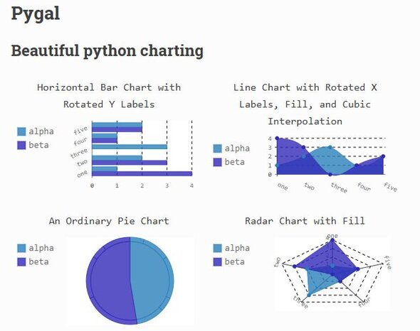
In a similar fashion to Bokeh, Pygal is another Python visualization library that makes interactivity a top priority.
Through features like data exploration and filtration, it allows you to create intricate and interactive charts and graphs, which you can then export and embed onto websites or apps. It even supports scalable vector graphic (SVG) exports, which allow you to maintain the quality and detail of your visualizations as you scale them up.

Plotly
Free and open-source, Plotly is another data visualization library for Python.
With this library, you’re free to create dozens of different chart types, from classic bar and pie charts to box plots and sparklines. It even goes beyond the realm of 2D, with 3D visualization generation, and it’s one of the few libraries capable of contour plot creation.
Geoplotlib
As you may be able to guess from the name, Geoplotlib is a Python library for working with geographic data.
With this data visualization library, you’re able to plot entire geographic maps in various forms and with fantastic levels of resolution. That includes the likes of density or symbol maps, though you’ll need both NumPy and Pyglet (both open-source libraries for Python) beforehand if you wish to use this library effectively.
Gleam
Another terrific Python data visualization library, Gleam is based on the fundamentals of the open-source R package, Shiny.
Gleam has the unique benefit of using nothing but Python scripts to transform your visualizations into web apps, rather than resorting to other programming languages. This makes it really easy to not just create charts and graphs with Gleam, but to export and present them, as well.
Altair
Built on the foundations of Vega and Vega-Lite, Altair is a popular tool for creating very beautiful and engaging visualizations.
Let’s say you’re preparing some charts for a stakeholders meeting or want to present your data in the most appealing way possible. This library will help you do so by offering the creation of bars, pies, histograms, and several more visualizations, with high interactivity and deep levels of data exploration.
Looking to Elevate Your Data Visualization? Try Julius AI Today for Free
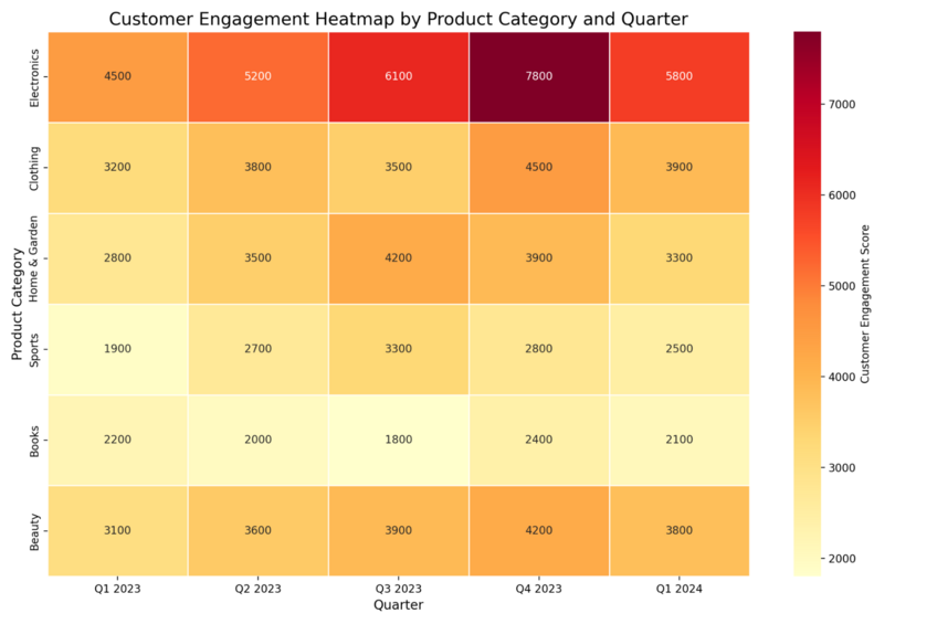
Python libraries for data visualization, like those listed above, are fantastic tools for plotting and visualizing data in numerous ways. However, some come with steep learning curves and demand a certain investment of time and effort to master. If you’d prefer a simpler option, why not consider Julius AI?
Julius AI is an AI-powered data analysis tool for the modern age. Harnessing the power of machine learning, it can solve complex data equations in seconds, as well as generate precise visuals in varying formats according to your precise needs.
In short, you can simply feed it data and tell it how you want that data presented. Then, it’ll do all the hard work for you – no complex coding or steep learning curves involved. It’s a dream data visualization tool for academics, students, data scientists, and others. Give it a try today.
