November 17th, 2024
Healthcare Data Visualization Guide: Examples, Benefits & More
By Matt Brockman · 8 min read

Without proper data analysis and visualization tools, the complex data generated by the healthcare sector is meaningless. That data just becomes numbers on a page. It’s through analysis followed by visualization that the data transforms into meaningful information that can actually improve patient outcomes.
That’s not limited to sorting through the reams of data the average medical study produces, either. Doctors and nurses use healthcare data visualization tools daily for patient reviews and to identify trends within their hospitals.
So, we have some questions. What is healthcare data visualization and how does it help healthcare providers help people like you when you need treatment? Discover the answers here and learn why health outcomes improve when visualization is involved.
Data Visualization in Healthcare
You might think that health data visualization is a modern concept. It has to be, right? Digital visualization tools give healthcare providers the ability to parse through more raw data than ever before. While that’s true, visualizing data to improve patient outcomes is a concept that has been around since the 19th century.
In the U.K., for instance, Florence Nightingale used a polar-area diagram to demonstrate the relationship between sanitary conditions and the likelihood that a soldier would die from wounds sustained on the battlefield. It seems simple – poor sanitation leads to more deaths. But in 1858, when Nightingale created her chart, the world didn’t know much about why infection happens. Her visualization techniques unveiled key information that changed the course of how soldiers were treated for their injuries.
Fast-forward to more modern times and we see data visualization techniques used throughout the healthcare sector. Graphs of vital signs let doctors see the changes in your physiology. Fishbone diagrams and similar visualizations are used to analyze and present lab results. Being able to represent the mounds of data collected for just a single patient enables the healthcare sector to improve medicines, processes, and the treatment offered to patients.
Why Is Data Visualization Important in Healthcare?
The simple answer is that we wouldn’t know nearly enough about any aspect of healthcare if we didn’t have methods for visualizing the data collected in studies and hospitals. Healthcare data is complex data, and it’s data visualization that delivers key benefits like the following.
Empowered Decision-Making
What do you think would happen if your doctor couldn’t visualize key data – such as your pulse rate – in real-time? Misdiagnosing conditions and slow decision-making could be the answers. Data visualization techniques allow doctors to monitor vital metrics, such as oxygen saturation and the previously mentioned pulse rates, so they can make fast decisions for your care.
Trend and Pattern Recognition
Blow data visualization up to a multi-patient or study participant scale and you get healthcare data that’s so complex it’s impossible to parse without healthcare data visualization solutions.
For example, a single study could involve thousands or even hundreds of thousands of participants. That’s a lot of data being collected. Visualization tools allow healthcare providers to see what the collected data is telling them so they can identify patterns, and the factors lying behind those patterns, that impact general health.
Data Simplification
Keep it simple and you keep it fast. That’s the key to data visualization in any sector, and it’s especially important in healthcare. Graphs and charts allow medical professionals to simplify how they present data, be it to colleagues or patients. Easy interpretation of complex data comes as a result of visualizations. Practitioners from multiple medical disciplines can understand each other far more easily with the right visualizations than if they just shared raw data.
Common Examples of Healthcare Data Visualizations
We could talk for days about the many visualizations used in the healthcare sector. Instead, let’s look at a quick rundown of some of the most common healthcare data visualization tools and how they’re often used.
Charts and Graphs
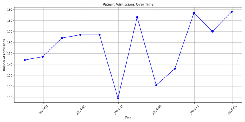
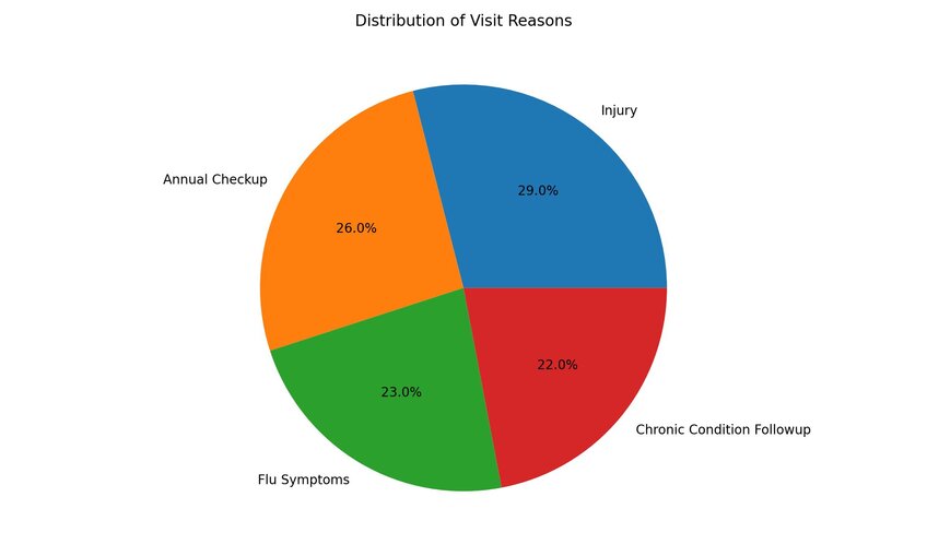
Line charts, scatter plots, bar charts, and practically any other data-focused chart allow medical professionals to plot out data in a way that makes sense.
Take line charts, for instance. Line charts let you plot out a variable and its impact over time to allow the identification of trends. You’ll often see them used in studies where researchers examine the impact of a new drug over a set period.

Electronic Health Records
Whenever a patient visits a medical facility, that facility either generates or updates an EHR. That record offers the “highlights” of the patient’s medical history and treatment record. It also includes key details such as their demographic and diagnostic information, all laid out in a tabular format so the doctor can see the most important details about a patient with a quick glance. Think of them as patient-specific dashboards for visualizing patient health data.

Infographics
Have you ever visited a health website that uses a series of images to demonstrate steps or triggers for health outcomes? Then you’ve probably seen an infographic. Though they’re not often used on the more technical side of the healthcare spectrum, infographics often help medical professionals communicate complex information to laypeople – i.e., patients.
How to Choose the Right Visualization for Your Healthcare Data
It’s tough to determine which healthcare data visualization techniques to use to simplify and demonstrate your dataset. Think about these factors when making your choice:
- What’s Your Question?: Every data analysis starts with a question that you’re trying to answer. Understand the goal of your research or interaction and you can eliminate some visualization techniques that aren’t suitable.
- What’s Your Data?: If you’ve collected reams of data about the impact a drug has on hundreds of research participants, you’re not going to use an infographic to visualize your findings. You’ll need a line chart or something similar. The type of data you collect influences the visualization you use.
- Who’s Your Audience?: Your intended audience impacts your data visualization decisions. Consider the dashboard example. A doctor needs to see different metrics on a dashboard than a patient does, so you have decisions to make about what to include and what to leave out for each.
Looking for Better Data Visualizations for Your Career? Give Julius AI a Try Today
As important as proper visualization is to healthcare organizations, there are still plenty of complexities. Datasets need compiling. They require manual work before they can be visualized in a way that makes sense to the intended audience.
What if there was a way to complete that process in minutes instead of days? Julius AI does that by empowering you to chat with your healthcare files and datasets to derive expert-level insights in seconds. Try it today and find out why 1.2 million people and counting use Julius AI to generate charts, reports, and data analyses.
Frequently Asked Questions (FAQs)
Is Tableau used in healthcare?
Yes, Tableau is widely used in healthcare for its powerful data visualization capabilities. It allows healthcare professionals to analyze patient data, monitor hospital performance, and identify trends in real time, enabling more informed decision-making and improved patient outcomes.
What is predictive analytics in healthcare?
Predictive analytics in healthcare involves using historical data, machine learning, and statistical algorithms to forecast future outcomes. This helps providers identify risks, predict disease progression, and optimize treatment plans to improve overall health outcomes for patients.
What are the limitations of big data analytics in healthcare?
While big data analytics offers tremendous insights, it comes with challenges like data privacy concerns, integration issues between disparate systems, and the need for advanced tools and expertise to process complex datasets. Additionally, poor data quality or incomplete information can limit the accuracy and reliability of analyses.
