October 3rd, 2025
11 Best Tableau Competitors and Alternatives I Tested in 2025
By Tyler Shibata · 21 min read

Tableau is a business intelligence platform known for dashboards and data visualization, but its high licensing costs and steep learning curve can slow your team down.
Platforms like Power BI, Qlik, Sigma, and Julius offer different approaches, from spreadsheet-style workflows to AI-driven analysis. I tested 11 tools in 2025 to see how they compare and where each one fits.
In this article, we’ll cover:
Tableau competitors at a glance
Why I looked for alternatives
How to choose your tool
11 Best Tableau competitors: At a glance
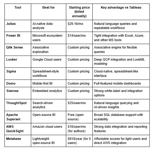
Why I looked for Tableau alternatives
Tableau can deliver polished dashboards, but cost and complexity often hold teams back. I saw licensing costs rise quickly as more users needed access, which became a real budget concern when I was managing analytics for a growing team.
Even when Tableau’s price wasn’t the main roadblock, setup and adoption were sometimes heavy. Business users often struggled with the learning curve, so I ended up fielding constant requests to update or explain dashboards.
Connecting data sources worked, but more complex cleaning and transformation often required Tableau Prep or external tools before I could start visualizing results. When I looked at other Tableau reviews, they echoed the same sentiments.
From what I’ve tested and heard, three pain points drive most teams to look for alternatives to Tableau:
Licensing pressure: Costs increase quickly as more users need access.
Steep learning curve: Non-technical users often need extra training to be productive.
Data prep limits: Cleaning and transforming data often requires leaving Tableau.
These gaps pushed me to test other BI tools to see which ones solved these challenges more effectively.
1. Julius: Best for AI-native data analysis
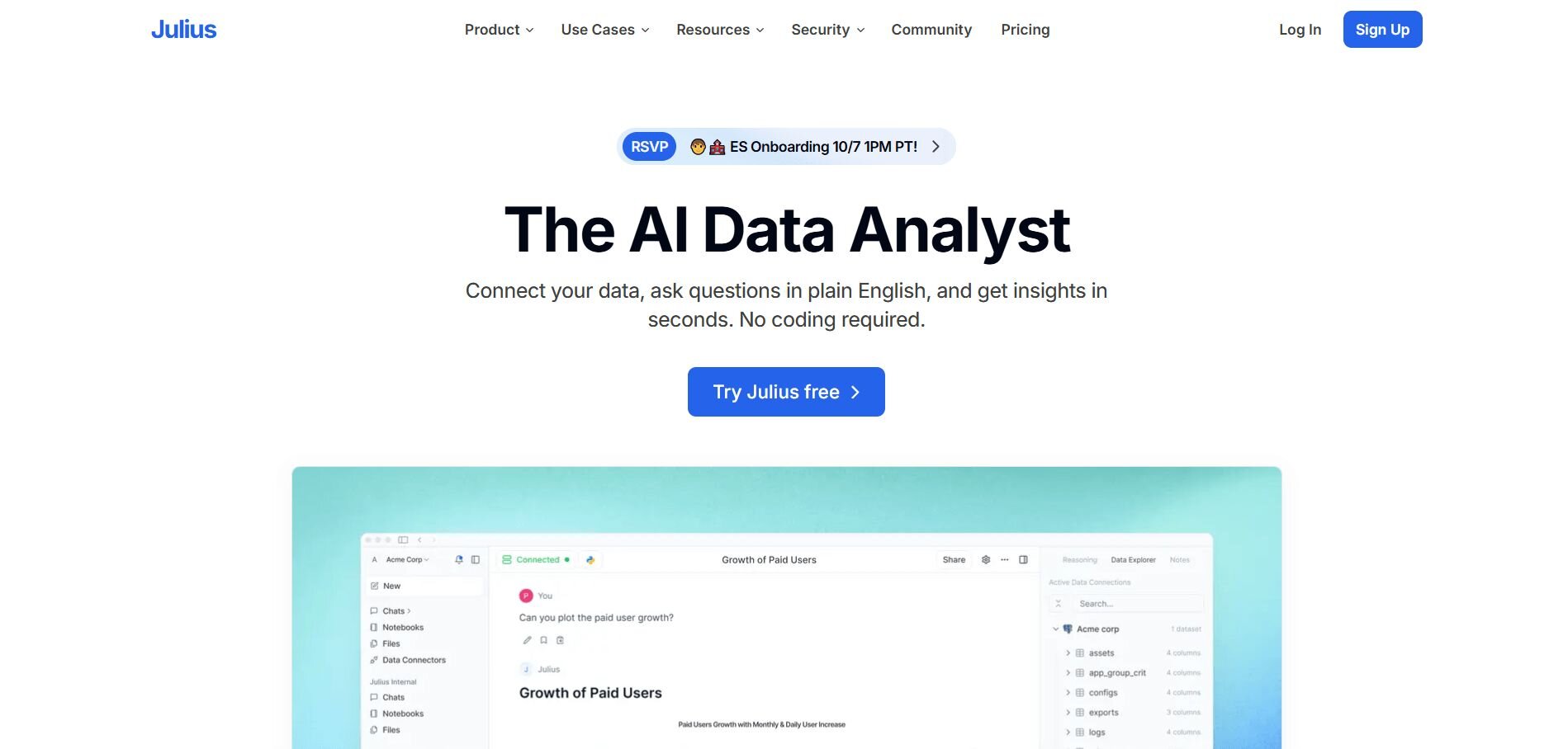
We designed Julius to make everyday analysis faster for teams without SQL. You can upload a CSV, connect a warehouse like Snowflake, or link Google Ads, then ask questions in plain language and see charts fast.
Notebooks help save recurring checks, like churn or cash flow, so they can be rerun with new data. Reports can also be scheduled to Slack or email, which keeps updates flowing without extra manual work.
Why it beats Tableau
Lower entry cost: Free plan plus affordable tiers
Faster setup: Connect data and ask questions in minutes
Easier access: Non-technical teammates can use it right away
Pros
Direct connectors for Postgres, Snowflake, and Google Ads
Scheduled reports via Slack or email
Repeatable Notebooks for weekly metrics
Cons
Not for full enterprise forecasting
Smaller ecosystem than legacy BI
Pricing
Julius has a free forever plan, then paid plans start at $29.16 per month, for 250 messages to Julius per month.
Bottom line
Julius is a good choice for quick analysis and recurring updates. It saves time but isn’t designed to handle every enterprise requirement, so you may need to use it in combination with other tools.
2. Power BI: Best for Microsoft ecosystem users
I’ve used Power BI with teams that worked heavily in Excel and Azure. It connects directly to Microsoft services, so pulling data from spreadsheets, cloud storage, or SQL Server was simple. The drag-and-drop interface was approachable for Excel users, though advanced visuals often required learning DAX (Power BI’s formula language, similar to Excel formulas).
On lower-tier plans, refresh limits slowed larger reports and sometimes forced an upgrade. We compared Power BI vs Tableau vs Julius if you’re stuck choosing between the three.
Why it beats Tableau
Lower starting cost: Entry plans start at $10 per user per month
Better Microsoft integration: Smooth connection with Excel, Azure, and SharePoint
Faster onboarding: Familiar feel for users with Excel experience
Pros
Affordable starting price compared to Tableau
Large ecosystem and community support
Direct integration with Microsoft products
Cons
More complex reporting can require learning DAX formulas
Performance issues in basic tiers with large datasets
Pricing
Free plan with limited refreshes. Paid plans start at $14 per user per month.
Bottom line
Power BI is a strong fit if your team already runs on Microsoft tools. It brings quick wins for Excel-heavy workflows, though advanced use cases can demand more training.
3. Qlik Sense: Best for associative exploration

When I tested Qlik Sense, what stood out was the freedom to move through data without being locked into a set query path. I could dive into related metrics and spot links I hadn’t planned to check. This flexibility comes from Qlik’s associative engine, which highlights relationships across datasets as you explore.
The tradeoff was setup time. Getting everything configured and optimized for larger datasets took longer than I expected, and performance sometimes lagged when handling very heavy loads.
Why it beats Tableau
Unique exploration: Associative model uncovers hidden links without predefined queries
Deployment options: Works on-premise or in the cloud
Interactive analysis: Easy to pivot mid-analysis without starting over
Pros
Strong for ad-hoc exploration
Flexible deployment choices
Intuitive filtering and navigation
Cons
Setup takes time and resources
Can slow down with very large datasets
Pricing
Qlik Sense offers custom pricing. Contact sales to learn more.
Bottom line
Qlik Sense shines if you want flexible, on-the-fly exploration. It offers a different way to work with data than Tableau, though the setup and performance demands may not suit every team.
4. Looker: Best for Google Cloud users
I tried Looker while working with teams already on Google Cloud, and the integration was seamless. Its modeling language, LookML, gave strong control over how data was defined, but it required more technical skill than I expected.
Once set up, dashboards were flexible and real-time data views were reliable. The challenge was adapting Looker to non-Google environments, which often required extra work.
Why it beats Tableau
Tighter Google Cloud integration: Smooth use with GCP services
Flexible modeling: LookML defines data consistently
Real-time insights: Dashboards update quickly once connected
Pros
Deep Google Cloud integration
Flexible dashboards and customization
Strong governance through LookML
Cons
Steeper learning curve for LookML
Less friendly outside Google environments
Pricing
Looker offers custom pricing. Contact sales to learn more.
Bottom line
Looker is a strong fit for teams already in Google Cloud. It provides powerful modeling and reliable dashboards, but requires technical resources to get the most out of it.
5. Sigma: Best for spreadsheet-style workflows
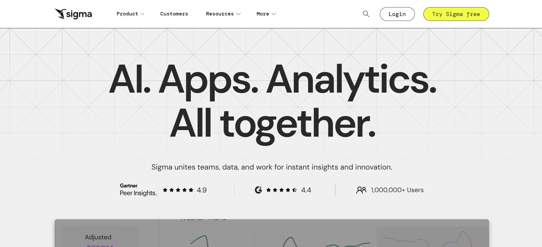
I tested Sigma with teammates who were comfortable in Excel but not SQL. The interface looked like a spreadsheet, so they could jump in and run analyses without extra training. Queries processed in the cloud, which made working with live warehouse data straightforward. While customization was strong, more advanced modeling still required technical support.
Why it beats Tableau
Spreadsheet-like UI: Easier for non-technical users
Cloud-native: Runs directly on warehouse data
Custom dashboards: Flexible reporting options
Pros
Lower barrier for spreadsheet users
Strong collaboration features
Handles large datasets through cloud architecture
Cons
Advanced work may need technical skills
Pricing isn’t fully transparent
Pricing
Sigma offers custom pricing with a free trial.
Bottom line
Sigma is a good option if your team prefers spreadsheets but needs access to warehouse-scale data. It lowers the entry barrier while still delivering powerful dashboards.
6. Domo: Best for mobile-first BI
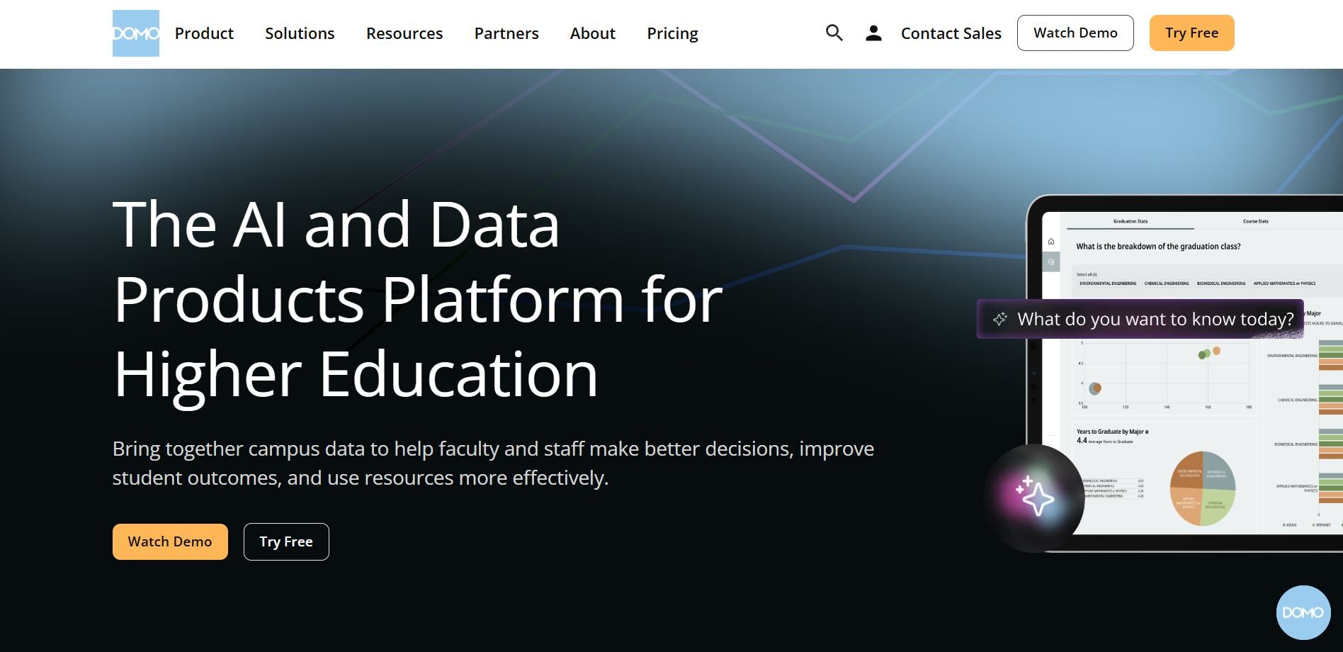
I tried Domo when I needed dashboards available on the go. Its mobile app stood out, giving full access to reports and alerts. Connecting multiple data sources worked, but the platform was heavy to set up and often required extra technical help. For smaller teams, pricing was also a hurdle, since there aren’t any cheaper plans available.
Why it beats Tableau
Mobile access: Full-featured app for reporting anywhere
Broad integrations: Connects many data sources
Comprehensive platform: Covers BI and collaboration in one place
Pros
Strong mobile experience
Wide range of connectors
Built-in collaboration tools
Cons
Pricing starts high for small teams
Setup can be complex
Pricing
Domo offers a 30-day free plan, then moves to custom pricing that’s often quoted in enterprise ranges. Talk to sales to learn more.
Bottom line
Domo delivers if mobile access is a priority. For leaner teams, though, the pricing and setup demands may outweigh the benefits.
7. Sisense: Best for embedded analytics
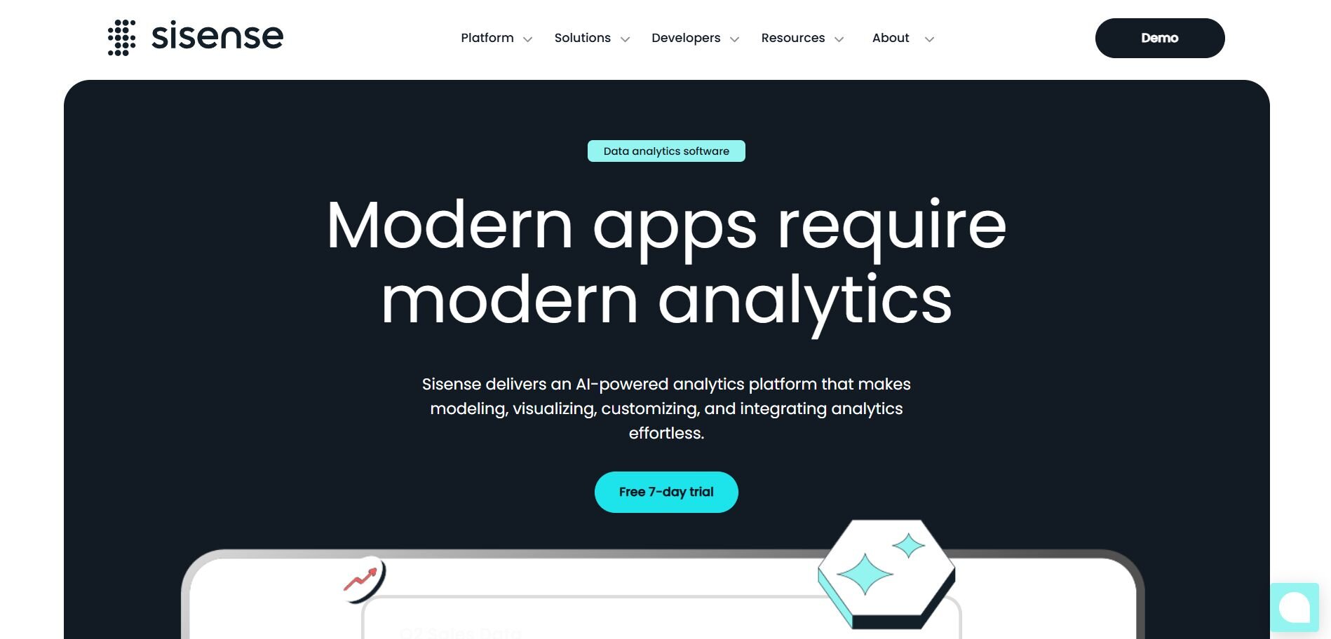
I used Sisense while building dashboards that needed to sit inside another application. The platform gave strong embedding options and customization for white-label projects. Setup took more effort than expected, and larger datasets needed extra tuning to keep performance smooth.
For teams evaluating software like Tableau, Sisense is a stronger choice when the priority is embedding analytics into client-facing products.
Why it beats Tableau
Embedding strength: Easy to place dashboards inside apps
Customization: White-label options for client use
Flexible integrations: Connects with many data sources
Pros
Strong embedded analytics
Customizable dashboards
Good developer support
Cons
Resource-heavy setup
Advanced performance tuning is often required
Pricing
Sisense offers custom pricing. Book a demo to learn more.
Bottom line
Sisense makes sense when embedding analytics is the priority. It requires more setup effort but offers the flexibility that Tableau can’t match for white-label use cases.
8. ThoughtSpot: Best for search-driven analytics
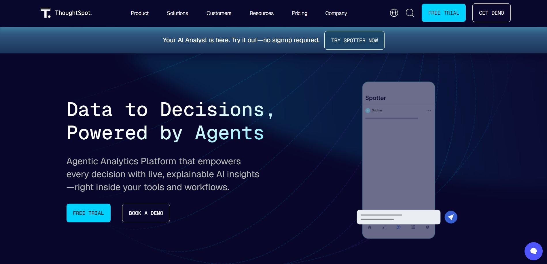
When I used ThoughtSpot, the main draw was its search-driven approach. The standout feature was natural language querying. I could type a question and get charts back fast, which made quick checks during meetings easy. The platform leaned heavily on AI-driven insights, but setup took time and adoption required shifting habits for teams used to more traditional dashboards.
Why it beats Tableau
Search-first design: Query data in plain language
AI insights: Surfaces patterns automatically
Flexible deployment: Works in cloud or on-premise setups
Pros
Easy natural language queries
Strong AI-driven recommendations
Interactive dashboards with live updates
Cons
Cultural shift for teams used to dashboards
Higher pricing for smaller teams
Pricing
ThoughtSpot starts at $25 per user per month, billed annually for up to 25M rows of data.
Bottom line
ThoughtSpot is a good choice if natural language search is a must-have. It shortens the path from question to answer but asks teams to work differently than they would in Tableau.
9. Apache Superset: Best for open-source BI
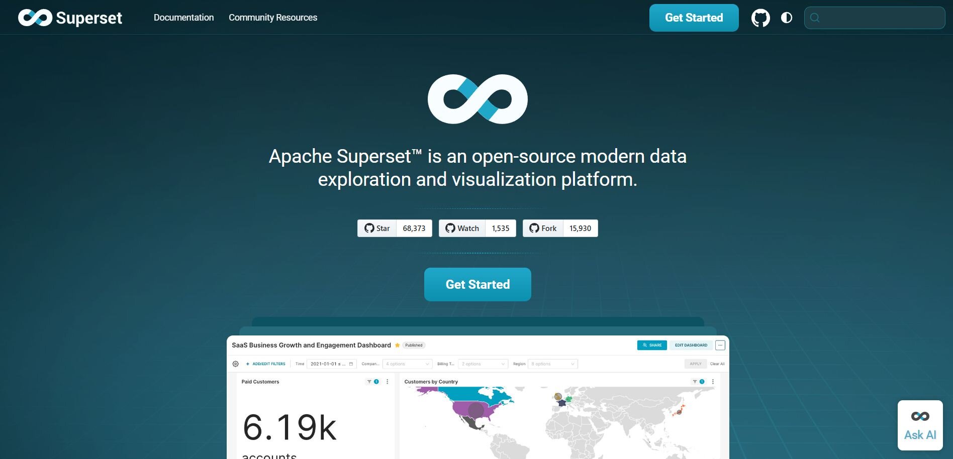
I tried Apache Superset for a project where the budget ruled out paid BI tools. It connected smoothly to SQL databases and supported a wide range of visualizations. The interface was clean enough once configured, but setup required technical skills and documentation was my main support option. Superset worked well for prototyping and internal dashboards, though scaling to non-technical users wasn’t simple.
Why it beats Tableau
Free to use: No license costs
Wide SQL support: Connects to many databases
Customizable: Open-source flexibility
Pros
Completely free
Active open-source community
Strong SQL database coverage
Cons
Steep setup curve
Limited support for non-technical users
Pricing
If you’re looking for free Tableau alternatives, Apache Superset is 100% free and open-source.
Bottom line
Apache Superset is ideal if you need a free, SQL-driven BI option. It saves costs but requires technical skills to get value.
10. AWS QuickSight: Best for Amazon Cloud users
I used QuickSight while working with a team already running workloads on AWS. Connecting to services like Redshift and S3 was straightforward, and the dashboards updated reliably. Unfortunately, customization was more limited compared to Tableau, and the interface was less intuitive for new users.
Why it beats Tableau
Pricing model: Pay-per-session option lowers costs for light users
AWS integration: Connects directly with Redshift, S3, and other services
Cloud-native: Scales automatically with workloads
Pros
Affordable for occasional users
Seamless with AWS ecosystem
Reliable cloud performance
Cons
Limited customization options
Interface can be counterintuitive
Pricing
For a monthly author license, you can expect to pay $18 per user per month.
Bottom line
QuickSight is a good pick if your company already relies on AWS. It offers affordable access for casual users, though customization and usability lag behind Tableau.
11. Metabase: Best for lightweight open-source BI
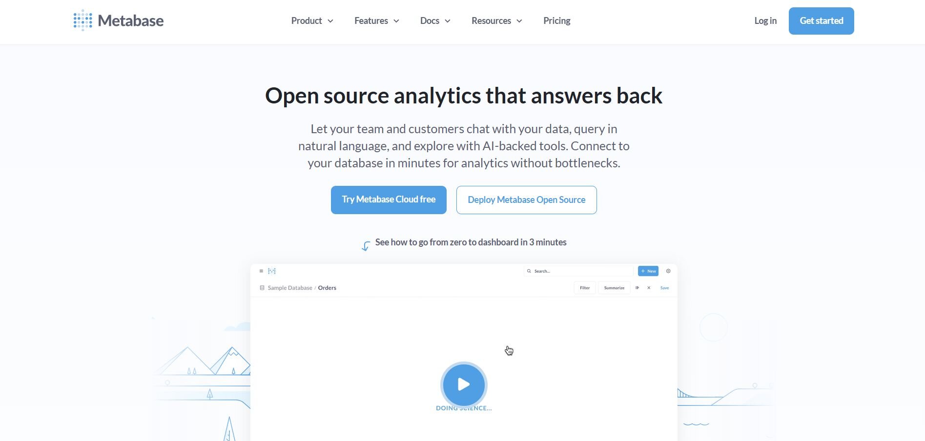
I ran Metabase for a small team that needed dashboards without SQL. The setup was simple, and the interface was user-friendly enough that non-technical users could run queries without needing SQL. Scheduling reports to Slack or email kept updates flowing, though larger or more complex projects exposed its limitations. It’s great for lightweight use cases, but it can’t match Tableau or enterprise BI platforms for scale.
Why it beats Tableau
Easy onboarding: Simple setup and UI
Free option: Open-source version available
Team-friendly: Works well for small groups
Pros
No-code querying
Quick to set up
Active community support
Cons
Limited for complex use cases
Advanced features require paid hosting
Pricing
Metabase offers a free open-source version. Paid cloud plans start around $918 per year for 5 users.
Bottom line
Metabase is a solid fit for small teams that want simple dashboards without the overhead of enterprise BI. It’s easy to start with but less suited to complex deployments.
How I tested these Tableau software competitors
To compare Tableau competitors fairly, I set up trial accounts or requested demos, then ran the same core jobs in each tool. I used finance and marketing datasets because teams often turn to Tableau for those kinds of dashboards. This gave me a consistent way to see how each platform made work easier or harder.
Here’s what I focused on:
Setup speed: How long it took to connect data, load a warehouse, and create the first chart.
Ease of use: Whether a manager without SQL skills could run queries and understand the results.
Visualization quality: Whether dashboards came out clean and clear enough for leadership reports.
Integration coverage: If connectors for Snowflake, Postgres, and Google Ads were available and easy to use.
Pricing clarity: Which vendors published entry-level pricing and which ones required a sales call.
This framework also helped me see which Tableau alternatives fit smaller teams that want fast results and which ones leaned more toward enterprise setups.
How to choose your Tableau alternative
Cost, usability, and scale matter most when picking between Tableau competitors. Choose:
Julius → for fast answers in plain language without SQL.
Power BI → for Excel-heavy teams that want affordable pricing.
Looker → for companies running on Google Cloud that need strong governance.
Sigma Computing → for teams that prefer a spreadsheet-like interface with warehouse data.
Qlik Sense → for exploring complex data relationships through its associative engine.
Domo → for organizations that value mobile dashboards and collaboration in one platform.
Sisense → for embedding analytics directly into apps or client portals.
ThoughtSpot → for search-driven analytics and natural language queries.
AWS QuickSight → for companies already invested in AWS, needing cost-effective access.
Apache Superset → for teams that want a free, open-source BI tool with SQL skills.
Metabase → for small groups that need lightweight dashboards without enterprise complexity.
My verdict
Testing these Tableau competitors showed me that no single tool wins across every situation. The right choice depends on how your team works and what they value most.
Julius stood out whenever I needed quick answers without writing SQL. I could ask for revenue by region or churn by month and get a chart fast, then schedule updates straight to Slack or email.
Tableau still offered extensive flexibility in visualization options, while Power BI made analytics more approachable for Excel-heavy teams. Looker proved strongest for governance at scale, and ThoughtSpot delivered when I wanted fast, search-driven insights.
Ready to try something beyond Tableau? Start with Julius
We built Julius to make everyday analysis faster, from weekly revenue checks to board-ready summaries. If you’re exploring Tableau competitors because of cost or complexity, Julius handles daily reporting, quick forecasts, and performance tracking without the extra overhead.
Here’s how Julius can help:
Natural-language questions: Type “Show revenue by region” or “Customer churn by month” and see results immediately.
Direct connectors: Bring in data from Snowflake, Postgres, or BigQuery without code.
Automated reporting: Schedule recurring updates to email or Slack so the team stays current.
Quick checks: Run fast pulls for board decks, investor updates, or team reviews.
Notebooks: Save analyses like churn or revenue reports and rerun them anytime with fresh data.
Ready to see how Julius compares to your current stack? Try Julius for free today.
Frequently asked questions
What are Tableau’s hidden costs?
The main hidden costs in Tableau come from licensing and scaling. Adding users can quickly push the price higher, even if those users only need view access. You may also face additional expenses for data prep tools, training, and server resources.
Are Tableau competitors good for product analytics?
Yes, many Tableau competitors like ThoughtSpot and Julius function as strong product analytics tools. These tools allow you to explore retention, churn, or feature adoption through plain-language queries. Others like Qlik and Looker provide flexible dashboards that help product teams monitor KPIs in real time.
Are there any other reporting tools like Tableau?
Yes, there are several Tableau-like reporting tool options like Power BI, Sigma, and Metabase that give you dashboards and data visualizations without the same level of setup or cost. Power BI is popular for teams already using Microsoft products, Sigma appeals to spreadsheet users, and Metabase offers a lightweight open-source option.
