November 15th, 2024
How to Use Data Visualization in Python
By Jaden Moore · 8 min read

Why is Python such a great language for data analysis and visualization?
Versatility, for a start. Python gives you access to a ton of libraries, all offered for free as it’s an open-source language that delivers variety in how you visualize data. There’s also the simplicity to consider. Python is a programming language. There’s no getting around that. But it’s one that’s designed with a syntax that at least feels familiar to English-language speakers so it doesn’t leave you going around in circles when you’re trying to analyze your data.
That brings us to your purpose for using Python – data visualization.
We’re going to explore how to create multiple graphs using a specific Python data visualization library to get you up and running with some basic Python data visualization.
What to Know With Data Visualization in Python
We love Python data visualization because it doesn’t restrict you to a single library. It has some built-in, of course, including the matplotlib library we’ll be using for these examples. But you have options. Seaborn is great if you need more attractive charts. If interactive plots are your thing, the Plotly library is ready and waiting. You can even integrate R’s ggplot2 using the plotnine library if you want to get all “Grammar of Graphics” about your visualizations.
The point is that you have options. Python makes data visualization as simple or as in-depth as you want it to be.
Popular Python Data Visualization Uses
Most of the following examples use the Tips database – which you can download from Geeksforgeeks – with the exception of the Heat Map example. You’ll build out the dataset yourself for that one using code provided by the matplotlib organization.
First, you’ll need to have the matplotlib library installed. Enter the following into Python:
Pip install matplotlib
Voila! The library is now yours for visualizing data as you see fit.
Table Display
We’ll assume you’ve already downloaded the Tips database. Open the CSV file and you’ll see it records the tips left behind by customers over a two-and-a-half-month period at a restaurant in the 1990s. There are seven columns:
- Total_bill
- Tip
- Smoker
- Sex
- Time
- Day
- Size
All pretty self-explanatory. Use the following code, courtesy of Geeksforgeeks, to display that data as a simple table using Python:
import pandas as pd
# reading the database
data = pd.read_csv("tips.csv")
# printing the top 10 rows
display(data.head(10))
You’ll see a table similar to the one you see when you open the CSV file for the Tips dataset.
Line Charts
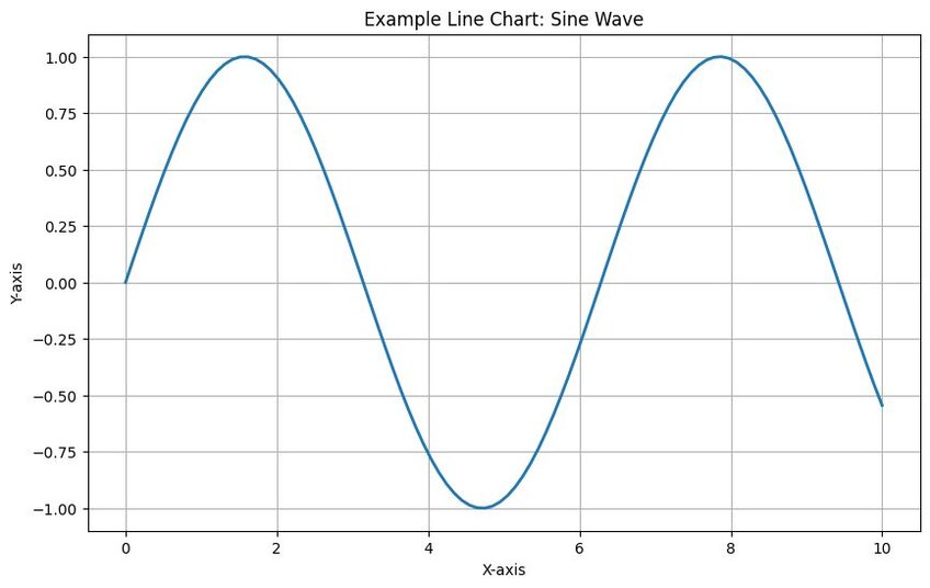
If you want to see trends in your data that you can compare over a set period, you need a line chart. They’re ideal for making predictions based on past data. You can create line charts using the matplotlib library using the “plot()” function. Use the following code – provided by Geeksforgeeks – to track tips against group sizes:
import pandas as pd
import matplotlib.pyplot as plt
# reading the database
data = pd.read_csv("tips.csv")
# Scatter plot with day against tip
plt.plot(data['tip'])
plt.plot(data['size'])
# Adding Title to the Plot
plt.title("Scatter Plot")
# Setting the X and Y labels
plt.xlabel('Size')
plt.ylabel('Tip')
plt.show()
You’ll see this code pulls from the Tips dataset and plots “size” on the x-axis with “tip” on the y-axis. Perhaps your hypothesis is that a larger group size leads to larger tips because more people means more food ordered. This line graph data visualization shows if you’re right and reveals if you can reasonably expect larger groups to tip higher in the future.
Bar Graphs
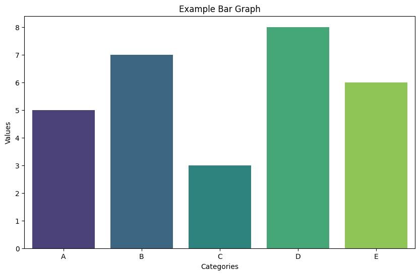
Also called a bar chart, a bar graph is a lot like a line graph in that it allows you to compare data to see if there are any changes over time or a similar metric. Matplotlib has a function for this too – “bar().” Let’s plot out a bar graph showing the correlation, if any, between tip size and the day the tips are left:
import pandas as pd
import matplotlib.pyplot as plt
# reading the database
data = pd.read_csv("tips.csv")
# Bar chart with day against tip
plt.bar(data['day'], data['tip'])
plt.title("Bar Chart")
# Setting the X and Y labels
plt.xlabel('Day')
plt.ylabel('Tip')
# Adding the legends
plt.show()
You’ll get a simple graph with the days of the week running along the x-axis and average tips for those days on the y-axis. Did you guess that Saturday would be the highest-tipping day? The bar chart shows you if you’re right.
Histograms
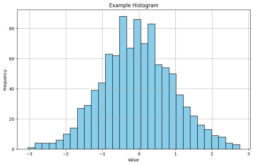
Think of a histogram as a type of bar chart that allows you to plot out ranges across the x-axis and the frequency of those ranges across the y. You can use the hist() function in matplotlib to create one of these data visualizations to see the frequency at which a certain value occurs within a dataset. Try the following code to plot a histogram for the Test dataset’s “total_bills” field:
import pandas as pd
import matplotlib.pyplot as plt
# reading the database
data = pd.read_csv("tips.csv")
# histogram of total_bills
plt.hist(data['total_bill'])
plt.title("Histogram")
# Adding the legends
plt.show()
Why would you want this particular chart? In the “total_bills” example, your histogram shows you the likelihood of a restaurant getting orders of a certain size. You’ll see the most common bill total, which can help you project income for the future.
Scatter Plots
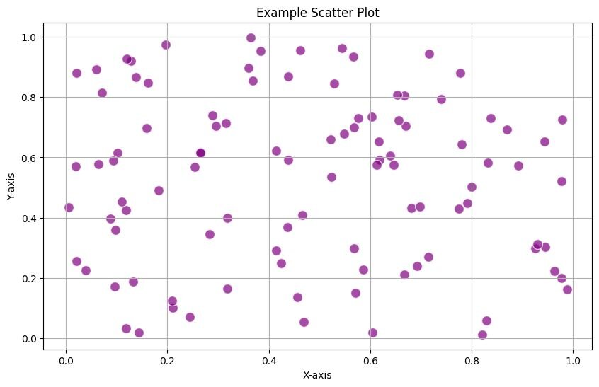
You’ll use scatter plots to map out dots on a grid that show the relationship between two or more variables. They’re ideal for testing relationships. For example, you might believe there’s a correlation between a customer’s total bill and the tip they leave in the Tips database. A scatter plot reveals whether that’s the case.
In matplotlib, you use the “scatter()” method to create scatter plots. Let’s create a scatter plot using the total bill and tip fields to see if there’s any correlation:
import pandas as pd
import matplotlib.pyplot as plt
# reading the database
data = pd.read_csv("tips.csv")
# Scatter plot with day against tip
plt.scatter(data['total_bill'], data['tip'])
# Adding Title to the Plot
plt.title("Scatter Plot")
# Setting the X and Y labels
plt.xlabel('Total Bill')
plt.ylabel('Tip')
plt.show()
You’ll get a scatter plot showing “tips” on the y-axis and “total_bill” on the x. Assuming your hypothesis is correct, you should see the tip dots climb higher on the chart as the bills increase.
Heat Maps
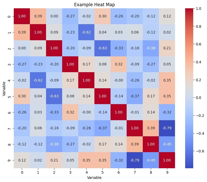
Heat maps are a little more complicated than the scatter plots and bar plots we’ve looked at so far. That doesn’t necessarily mean you’ll be working with more complex data with these visualizations. However, you will need to define color coding and may have to enter your data as a 2D array inside your code rather than drawing from a pre-existing dataset. Matplotlib shows us how it’s done with an “imshow” function and a dataset containing harvest numbers in tons for different vegetables and farmers:
import matplotlib.pyplot as plt
import numpy as np
import matplotlib
import matplotlib as mpl
vegetables = ["cucumber", "tomato", "lettuce", "asparagus",
"potato", "wheat", "barley"]
farmers = ["Farmer Joe", "Upland Bros.", "Smith Gardening",
"Agrifun", "Organiculture", "BioGoods Ltd.", "Cornylee Corp."]
harvest = np.array([[0.8, 2.4, 2.5, 3.9, 0.0, 4.0, 0.0],
[2.4, 0.0, 4.0, 1.0, 2.7, 0.0, 0.0],
[1.1, 2.4, 0.8, 4.3, 1.9, 4.4, 0.0],
[0.6, 0.0, 0.3, 0.0, 3.1, 0.0, 0.0],
[0.7, 1.7, 0.6, 2.6, 2.2, 6.2, 0.0],
[1.3, 1.2, 0.0, 0.0, 0.0, 3.2, 5.1],
[0.1, 2.0, 0.0, 1.4, 0.0, 1.9, 6.3]])
fig, ax = plt.subplots()
im = ax.imshow(harvest)
# Show all ticks and label them with the respective list entries
ax.set_xticks(np.arange(len(farmers)), labels=farmers)
ax.set_yticks(np.arange(len(vegetables)), labels=vegetables)
# Rotate the tick labels and set their alignment.
plt.setp(ax.get_xticklabels(), rotation=45, ha="right",
rotation_mode="anchor")
# Loop over data dimensions and create text annotations.
for i in range(len(vegetables)):
for j in range(len(farmers)):
text = ax.text(j, i, harvest[i, j],
ha="center", va="center", color="w")
ax.set_title("Harvest of local farmers (in tons/year)")
fig.tight_layout()
plt.show()
It’s a more complex bit of code, but you should get a data visualization showing the farmer's name on the x-axis and the vegetable on the y. Each segment of the visualization shows the tonnage number for the farmer and the vegetable. Then, there’s the color coding, with each number range showing a different color so you get a quick view of which farmer produced the most tons of each vegetable.
Pros and Cons of Using Python for Data Visualization
Pros
- A Ton of Libraries: You’re not restricted to in-built libraries like matplotlib for visualizing your data. Python has plenty more, most of which you can get for free because they’re open-source.
- Simpler Syntax Than Most: While Python still requires you to get to grips with coding, you’re at least working with a language that feels natural.
- Python Scales with You: You can visualize almost any dataset in Python, though larger sets come with some problems, as you’ll see in the…
Cons
- Memory Intensive: Python requires a lot of memory at even the basic level and you’ll find it becomes a serious resource-drainer with larger datasets.
- No Compiling: Python executes code line-by-line rather than compiling it and then executing it, making it slower than C and similar languages.
Try Julius AI Today to Unlock Faster, Better Data Visualization
So, Python is great if you’re a programmer. It’s super flexible and can handle multiple graphs as long as you have the right libraries installed. But not everybody is a dab-hand when it comes to coding. Python data visualization requires mastery of an entire language, which just isn’t possible if you’re looking to generate quick insights from a dataset for your reports.
Enter Julius AI.
Designed to allow you to chat with your datasets to extract valuable insights in seconds, Julius AI offers a no-code, AI-infused platform for data visualization. Think of it as ChatGPT for statistical datasets. Try Julius AI today – generate reports, advanced analysis, and attractive graphs in seconds from your datasets.
Frequently Asked Questions (FAQs)
What is the purpose of data visualization?
The purpose of data visualization is to transform raw data into visual formats like charts, graphs, and maps that make complex information easier to understand. It helps uncover patterns, trends, and insights that might not be immediately obvious in raw data, enabling better decision-making and communication.
What are the 5 steps in data visualization?
The five key steps in data visualization are:
1. Understand Your Data – Identify the type, quality, and purpose of the data you’re working with.
2. Choose the Right Tools – Select tools like Python libraries (e.g., matplotlib, seaborn) or platforms like Julius AI.
3. Determine Your Audience – Tailor your visualization to match your audience's needs and expertise level.
4. Select the Best Visualization Type – Pick visual formats like bar charts, scatter plots, or heat maps based on the data and desired insights.
5. Refine and Present – Optimize the design for clarity, accuracy, and visual appeal before sharing it.
What are the disadvantages of data visualization?
Data visualization, while powerful, can sometimes oversimplify complex data, leading to misinterpretation. Additionally, creating high-quality visualizations requires time, skill, and the right tools, which can be a challenge for those without technical expertise. Finally, poorly designed visuals may introduce bias or obscure key insights rather than clarifying them.
